
“Perfection” is a heady topic for an art exhibition. But Able Baker Contemporary in Portland has made an excellent show by presenting works that orbit the subject visually and conversationally, rather than trying to own it theoretically.
Particularly impressive is the what curator Hilary Irons has left out. The potentially vast list of exclusions begins with traditional high-focus realism and hard-edged geometrical abstraction, but it also includes photography and fine craft. “Perfection” is fundamentally a painting show that includes a few conceptualist sculptures. Its orientation as a painting show is, in fact, a subtle saving grace. Painting, after all, is the dotted middle line down the road of art. Our most meaningful historic conversations about art and its meaning generally fall to painting for reasons that go beyond ease: Painting can create any world it wants to. It can operate with mathematical precision. It can be physically literal or remain in the realm of illusion. It can copy. It can fool. It can be abstract or use words or collage elements. And not only does it reach deep into history, it has a relationship to philosophy from the very moments the Greeks launched classical Western philosophy. Here’s an ancient Greek story about judging art:
The painting competition between Zeuxis and Parrhasius as related by Pliny the Elder is widely known: Zeuxis first reveals his painting of grapes. It was so convincing that birds came and pecked at them. Zeuxis then called for the curtains to be pulled aside to reveal Parrhasius’s painting – but the curtain was his rival’s illusionistic painting. Zeuxis conceded. But for “Perfect,” maybe the alternative version is more fitting: Zeuxis paints a boy holding grapes. Birds fly down to peck at the grapes, but this annoys Zeuxis who believed that if had painted the boy more convincingly, the birds wouldn’t have gone after the grapes.
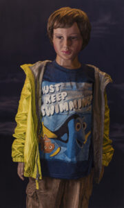
Philip Brou, “Nemo,” 2019, oil on linen, 18 by 30 inches. Photo courtesy of the artist
The moral of both stories, as it turns out, is that art is subjective. This is a seemingly simple observation, but it has to vie with ideas about essences, mathematical precision and optical exactitude. What we see in “Perfection” is that Irons intentionally tipped the balance of the selected work away from trompe l’oeil (“fool the eye”) towards a modernist sense of medium and material. In other words, no matter how skilled the artist, Irons wants the viewer to see the work as a painting: No one is trying to fool you.
Philip Brou’s oil painting “Nemo,” for example, portrays a boy in a T-shirt featuring the famous cartoon fish and his unforgettably forgetful companion. Brou’s skill in rendering the clothing is stunning, but we’re troubled by the boy’s plastic appearance. Basically, Brou is so skilled that it becomes clear that he’s painting a mannequin instead of a real boy. (There’s a Shrek joke in there, if you’re a kids’ movie veteran.) It’s a conceptual conundrum: literalist illusionism.
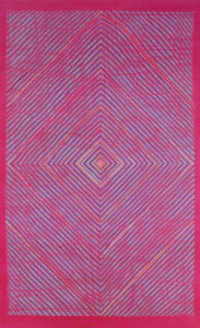
Grace DeGennaro, “Weaving (Magneta),” 2018, oil on linen, 78 by 48 inches. Photo by Luc Demers
Carly Glovinski’s two works similarly soar in this setting. One is a dish towel. The trick is that it is clearly a fake dish towel, and it’s not that convincing. But the overall issue of recognizability distracts you from realizing the shadows on the towel are fake. Glovinski’s other work is a book that plays the part of a shelf. There is a pair of intriguing objects on top – one looks like a desert rose (a sand crystal, and it might be one) and the other looks like a bent piece of painted canvas. These odd objects are camouflage. The book’s clarity as a compelling but identifiably fake object is also a feint: The book is a shelf? The weirdness of this only comes completely into view when you look underneath the book and spot the “gum” stuck to its underside, like a bench or a school desk.
Actual precision is present. Isaac Jaegerman’s “Penumbra” works to combine a trompe l’oeil drawing of crumpled paper over dazzlingly precise geometric forms cut into black paper. These are elegant works, and their bifurcated logic is a coup for Irons’ intended conversation about illusion and precision.
Irons’ presentation of illusion in “Perfection” is nuanced. It’s not fragile like something that needs to be protected; it’s brittle because of its own self-inflicted shortcomings. She seems to have far more affinity for legibility and challenges than craft-oriented standards of production. Duncan Hewitt’s sculptural installation “Mirrors,” for example, features about 60 loosely carved hand-held mirrors. We see these easily for what they are in part because Hewitt has coded them about half pink and half blue. Quietly, he has brought gender – and therefore personal subjectivity – into the experience. The most brilliant point, however, is easy to miss: 1 in 10 of the mirrors is neither pink nor blue. It is black. I suspect Hewitt is making a point about gender (1 in 10 …), but it is an effective nod to so many possibilities of “other.”
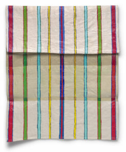
Carly Glovinski, “Stripy Towel,” 2017, acrylic on linen, 18 by 15 inches. Photo by Stewart Clements
One highlight of the show is the visuality of the curation. The center gallery features a visual conversation that starts with Grace DeGennaro’s “Weaving,” a 7-foot magenta canvas covered in a precise lozenge-shaped matrix of thousands of dots. Up close, they look perfect, but as you back away, you see DeGennaro’s organically meandering sense of line.
Next is Jim Creighton’s “24,” a monochrome white-painted rhombus of carved basswood. Creighton’s loose tool marks create the leading aesthetic in the work that seeks to establish a tension between its hard-edge minimalist geometry and organic textures.
Next is Gail Spaien’s “Renegade Mirage #13.” It’s like a nightmare vision of someone caught in the flatness of Will Barnet’s 1970s portrait worlds. It’s aggressively stiff and symmetrical: The pair of chairs look like they belong to the twin girls in the hallway of Stanley Kubrick’s movie take on Stephen King’s “The Shining.” Then back to Creighton whose two symmetrically balanced lozenges punctuate the wall brilliantly.
Unless, of course, you see Kate Russo’s pixel-filled ellipse paintings based on the palettes of Impressionist masterpieces. Visually, they’re perfect. And in this context, we can better sense her goals in reducing these famous paintings to their palettes: It’s a sort of exercise in essentializing.
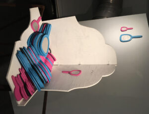
Duncan Hewitt, “Mirrors,” 2018, mirrors, carved and painted wood with wood fabrication. Photo courtesy of the artist
What “Perfection” gets exactly right is the force of personal experience. Mary Hart’s small mixed-media watercolors might illustrate this as well as anything: “Rubberband,” for example, features a blue ring on liquid loose black watercolor spilling into the textured kozo paper. It works as an abstract form, but once you see it as a rubber band then it’s a rubber band. But does that solve anything? Hardly. A blue ring in an abstract painting is easier to understand than a blue rubber band floating in space. Or do we write things off the moment we recognize them for what their authors intended them to be? I suspect the latter: The phenomenon of language instructs us to comprehend the term and move on – never are we to question the status of the signifier.
Irons’ success, however, is based in her seeking to start a conversation rather than beginning with her own conclusions and trying to force the viewers to agree. “Perfection” is fundamentally a visual show about visual ideas. There is no critical theory lurking around the corners waiting to pull the Derridian rug out from under your feet. Sure, there is a lot to talk about at this show, but there are no right or wrong answers and no ideological high ground and the language of the conversation is no one’s but your own.
Freelance writer Daniel Kany is an art historian who lives in Cumberland. He can be contacted at:
dankany@gmail.com
Comments are no longer available on this story