

Mary Judge, “Primavera Pop 14,” 2022, powdered pigment on paper, 30 x 30 inches (unframed), 34.5 x 34.5 inches (framed) Photo by Richard Springler/Courtesy of Kenise Barnes Fine Art, Kent, Conn.
As summer winds down, it’s time to catch up on shows that’ll disappear soon after the last tourists have headed home.
“Us & ME” (through Sept. 9) is the latest pop-up gallery phenomenon (happening with increasing frequency as dealers test the growing Maine art market for potential). Curated by Connecticut gallery Kenise Barnes Fine Art, it’s up at Alice Gauvin Gallery in Portland.
In the Midcoast, there are “Melanie Essex: Ultramarine” and “Lois Dodd: Structure” (both through Sept. 16 in Rockland), and the Monhegan Museum of Art & History’s “Counterpoint: Monhegan’s Artist Couples” (through Sept. 30).
VERY MIXED MEDIA
I’ve known Kenise Barnes and her associate director, Lani Holloway (who now lives in Portland), for probably 15 years. The gallery in Kent, Connecticut, represents some 50 mid-career and emerging artists, just over 35 of them on view in “Us & ME.” One of the most interesting aspects of “Us & ME” is the range of media it encompasses.
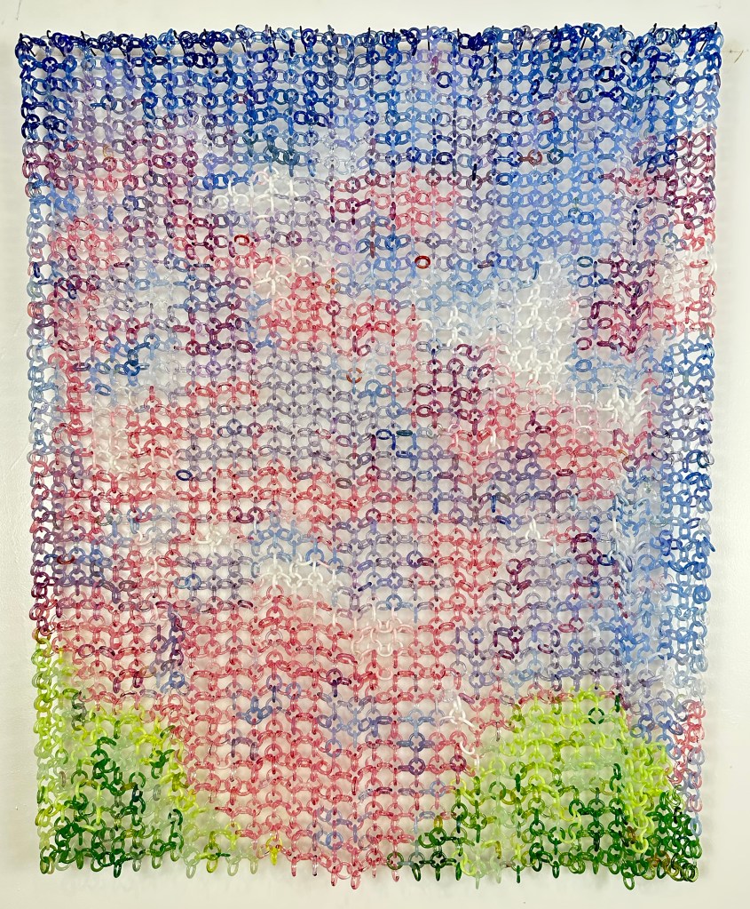
David Licata, “Magic Hour,” 2023, torch-worked borosilicate glass, 26 x 22 x 2 inches Courtesy of Kenise Barnes Fine Art, Kent, Conn.
There’s a lot of painting. But, for example, we have the work of New York-based David Licata, inspired by his hikes through the Hudson Valley. “Magic Hour” deploys his primary medium – chains he makes of torch-worked glass links in different colors – to depict a sky of pink clouds above green treetops. The more you look at it, the more impressive is its intensive labor and calculation.
Like me, Barnes gravitates toward work that requires obsessive concentration. Exhibit A: the mandalas of New York/New Jersey artist Mary Judge, who uses “spolvero,” a technique developed in the Renaissance. The designs begin with lines of tiny holes made on paper with a tracing wheel. Judge places this sheet over another paper and taps the lines with different powdered pigments bound in a bag. The pigments transfer to the lower sheet through the holes. Several steps of this process layer colors upon colors before Judge fixes the final design with a sealer. Understanding this helps us appreciate their astonishing complexity.
Donna Sharrett, “Bud 9.29,” 2019, guitar string ball-ends, clothing, needlework, jewelry, thread, 5 x 5 inches (unframed), 10 x 10 inches (framed) Courtesy of Kenise Barnes Fine Art, Kent, Conn.
Mandalas, in fact, abound. New York artist Donna Sharrett creates hers by sewing (again, obsessively) various materials – guitar-string ball ends, bits of clothing, needlework, jewelry – onto a surface, offering an intriguing and inventive twist on traditional so-called “women’s work.” These assemblages arose around the deaths of her mother and, later, her brother (the guitar parts are an homage to him, a musician), so they carry a whiff of memento mori that adds to their poignancy. Japanese-born Michiyo Ihara drafts her intricately detailed mandalas of nature imagery in graphite, their meticulousness evoking the wondrous intricacy (and delicacy) of nature and the cosmos. Eleanor White collages wood ash, chicken and emu eggshells, glass beads and polymer medium in her mandalas.
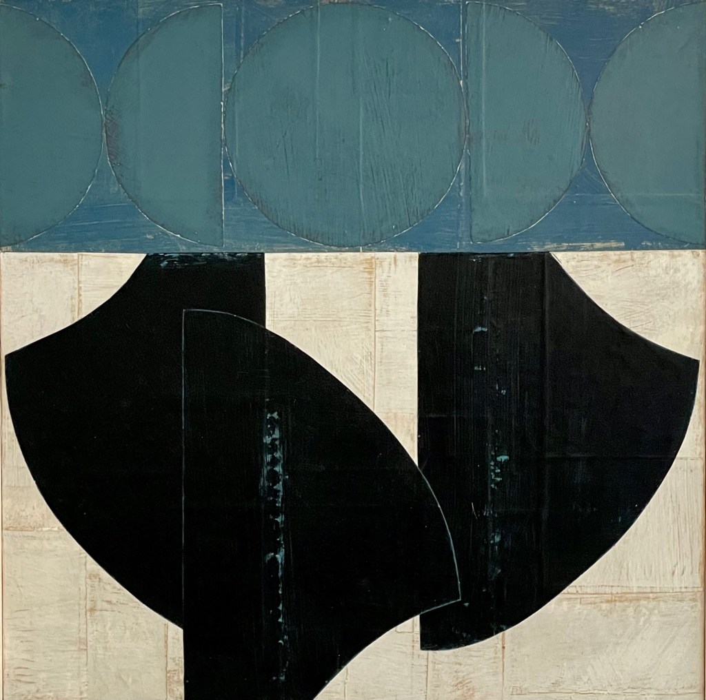
Daniel Anselmi, “Untitled (7-25),” 2023, painted paper collage on panel, 20 x 20 inches Courtesy of Kenise Barnes Fine Art, Kent, Conn.
There are two Maine artists on display: Belfast-based Daniel Anselmi and his partner, Marc Leavitt. Anselmi presents two exquisite little “Portraits” you might miss if you’re not looking closely. They are painted paper collages on panel and have the graphic charm, buoyant mood and organic forms of some of Picasso’s 1930s works (“Girl Before a Mirror,” or the portrait of his daughter Maya “Fillette au bateau (Maya)”). “Untitled (7-25)” traffics in Anselmi’s more familiar abstract shapes, which can be reminiscent of clothing sewing patterns, bones, saddle parts and other objects. Here, he handsomely bifurcates the collage with a modulated blue band at the top third and black forms on white below.
Leavitt’s “Stratum” is the result of his interest in spiritual texts and artworks from a variety of holistic traditions. They recall ancient petroglyphs or hieroglyphics and, amid the mottled field or oranges and yellows, seem to be transmitting some sort of message from another, unearthly desert-like realm.
CUSHING COHORT
Caldbeck Gallery has exhibited the work of various Cushing artists for over 40 years (along with many other Maine artists). Four shows currently hang here, two of them from this cohort: Lois Dodd and Melanie Essex. Dodd, of course, is a living legend, and has enjoyed a bang-up year of exhibitions, including a thorough retrospective at the Bruce Museum in Connecticut and a small show at Hopkins Wharf Gallery in North Haven (both recently closed).
Lois Dodd, “Double Door,” 1976, oil on panel, 20 x 14 inches Photo by Melanie Essex
Dodd’s work here concentrates on structures, of buildings and otherwise. It spans 1966 through 2011, picking up on several bodies of work. As always, she paints what is immediately around her, observing rooms, buildings, people, landscapes and so on with more or less detail. We see her interest in interiors manifesting in the earliest work, “Corner Loft” and, more reductively, in “Double Door” (1976).
Just in these two paintings we understand the breadth of ideas she is tackling, both in the way she stubbornly resisted prevailing trends (such as abstract expressionism, feminist, political or performance art), while also appreciating the compositional simplicity of others (photorealism, minimalist art) and even presaging something like geometric abstraction, which is toyed with in “Double Door” and one of my favorite works, “Blanket and Its Shadow at Noon” of 1995. The latter is all geometric form and color. Check out the way Dodd depicts the blankets’ shadows as two simple parallelograms.
Lois Dodd, “Blanket And Its Shadow At Noon,” 1995, oil on panel, 11 34. x 14 inches Photo by Melanie Essex
Geometry, in fact, is everywhere. Sometimes she mixes it with elements of abstraction (“Barn and Elm Tree” of 1985 – essentially a triangular structure with abstracted flora). Other times it dovetails with what to me was Dodd’s most intriguing work: her views through windows. “Ladder View” (1976) looks out through pane grids onto a view that seems vertiginous. The grid functions to stabilize the dizzy feeling of height while also confusing perspective.
The most surprising moments in Melanie Essex’s “Ultramarine” come in mostly monochromatic paintings that cross-pollinate the idea of abstract color studies (a la Josef Albers’s squares within squares) with representational landscape. This alone feels fresh, especially due to Essex’s predilection for intensely bright colors.
Melanie Essex, “Cadmium Solstice,” 2023, oil on panel, 15 x 15 inches Photo by Melanie Essex
I would have loved to see a series of paintings displayed in a single sequence: “Cadmium Solstice” (in mottled shades of citrine and chartreuse), “Lake, Monson” (sunflower and mustard yellow), “House and Low Red Cloud” (tomato and persimmon reds) and “End of Day” (primarily lime and canary yellow). Presenting them in this way would enhance the confidence and discipline required to mine various gradations of a single shade in these work, and to do so through a non-abstract language. There is great subtlety and beauty in this endeavor.
Melanie Essex “House And Orange Sky,” 2023, oil on panel, 15 x 15 inches Photo by Melanie Essex
Yet Essex explores other ideas here too, such as ways of depicting the liquid translucence of water. “House and Low Red Cloud” and “House and Orange Sky” are views of Essex’s house on the St. George River. In both she accomplishes that feat so simply, using only streaks of peachy orange paint. In some works she approaches her atmospheres more graphically, using thick black outlines on clouds and geological forms. And in one, “Under A Striated Sky,” Essex picks up on a long art continuum: juxtaposing foreground still life with background landscapes, a tradition that runs from early Netherlandish painting through Matisse and David Hockney.
COUPLES THERAPY
Auguste Rodin drove Camille Claudel, his studio assistant, muse and fellow sculptor, into madness. Diego Rivera and Frida Kahlo were almost as famous for their infidelities as their art, with Rivera even cheating on Kahlo with her sister. Francoise Gilot famously exposed Picasso’s artistic pettiness and jealousies in a 1964 tell-all memoir.
The four artist couples gathered in “Counterpoint,” however, enjoyed harmonious and productive relationships, with the possible exception of Lynne Drexler and John Hultberg (the former struggled with mental illness; the latter with alcoholism). The show doesn’t dwell on these people’s personal lives, preferring instead to juxtapose their works in ways that help us understand the interplay of ideas and influences flowing between them and, at times, how radically they diverged from each other.
John Hultberg, “Lobster Cove— Monhegan (Boats in the Ocean),” 1961, oil on canvas panel, 20 x 24 in., Monhegan Museum of Art & History, Gift of Elaine R. Wechsler Living Trust Courtesy of the Monhegan Museum of Art & History
All split their time between the pyretic New York art scene and placid Monhegan Island, though Drexler eventually deserted New York for her year-round Monhegan residence. She and Hultberg are arguably the most famous twosome on display. Drexler is especially well-known by virtue of being an aux courant “rediscovered” darling of the auction houses and galleries. Her work here is dazzling.
Lynne Drexler, “Untitled,” 1961, gouache on paper, 10 1/4 x 14 1/4 in., Monhegan Museum of Art & History, Gift of Harry T. Bone and William and Barbara Manning Courtesy of the Monhegan Museum of Art & History
It’s fascinating to see paintings like Hultberg’s “Lobster Cove—Monhegan (Boats in the Ocean)” and Drexler’s “Untitled,” both from 1961. These are hung at opposite corners of the museum, not within sight of each other, which is unfortunate since they show the similarities and differences of two artists at the same chronological point in their lives. Drexler’s work is unabashedly abstract, like the love child of her teacher Hans Hofmann and Alma Thomas (an artist I’ve never heard mentioned in the same breath as Drexler, though Thomas’s brushstrokes are identical, even if deployed in cleaner geometric, less expressionistic ways).
Hultberg’s work similarly pixilates the landmasses bordering the cove yet remains resolutely tethered to representation. Both artists began in an abstract vein, likely due to the prevailing trends of the time, and moved together toward figuration as they aged. In this instance, however, Drexler is the fearless one.
Hultberg departs spectacularly from Drexler in his penchant for emotional darkness and, at times, almost apocalyptic surrealism. “Forest Shrine (aka Felling the Forest)” of 1974 is magnificent if also profoundly sad. It is also foreboding when we consider humanity’s ongoing environmental depredations. We don’t know what “Frozen Spectres” of 1992 depicts exactly – overworked dock workers, people rebuilding after a natural disaster or a nuclear explosion, a war zone? – but we know it is not a joyful scene. Even “Lobster Cove” seems mournful.
Geraldine Tam, “Untitled,” 1951, casein/watercolor on paper, 8 3/4 x 4 in., Monhegan Museum of Art & History, Gift of Cindy King Courtesy of the Monhegan Museum of Art & History
Reuben and Geraldine Tam appear, at first, to be on opposite ends of the creative spectrum – Reuben all emotion and awe at the wonders of nature, Geraldine scientifically reproducing the flora of the island in explicitly realist botanicals. Yet in “Untitled” (1951), Geraldine depicts the ferry dock at Monhegan with obvious affection and, surprisingly, loosely sketched forms filled in with color.
Reuben Tam, “Burnt Head and Cloud,” no date, ink on paper, 14 1/4 x 17 1/4 in., Monhegan Museum of Art & History, Gift of Phoebe Palmer Courtesy of the Monhegan Museum of Art & History
This painting (and another of rowboats) is a cue to a deeper sensibility shared by both Tams: their connection to place and to the infinite miracles of the natural world. Geraldine eventually chose to venerate these with accuracy and precision. Reuben cut a different trail, depicting the many powerful promontories of the island and the vast ocean beyond. For him, what was spellbinding was the dynamic, more abstract energies that power the universe and humble us before it: the forcefulness of the wind and water, the moodiness of a stormy sky, the implacable density and weight of rock.
William McCartin, “Silent Space I,” 1969, acrylic on canvas, 40 x 50 in., Monhegan Museum of Art & History, Gift of Sally Anne McCartin Courtesy of the Monhegan Museum of Art & History
The styles of William and Jan McCartin seem less clearly defined. William, in particular, experimented across a wide array of styles. It’s a long way, for example, from the Cézanne-like marinescape “Untitled” of 1956 to “Silent Space I,” a collage-like abstraction that retains discernible references to life on the water (an oar, a sail, a buoy – however abstracted). It’s still another leap to the undated total abstraction “Interstice III,” which Susan Danly attributes in a fine catalog essay to the innovations of Color Field painters in New York. Yet I wonder if he was also looking at Richard Diebenkorn in this and other work such as “Blue Voyage” and “Untitled,” both from the 1970s.
Jan McCartin, “Untitled,” 1959, gouache on paper, 11 x 7 in., Collection of Alan Pederson and David Dixon Courtesy of the Monhegan Museum of Art & History
Except for one painting, Jan McCartin seemed to forge an entirely different path, painting conventional still life, landscape and portrait works. The exceptional painting, “Untitled” from 1959, reveals some affinities with her husband’s “Silent Space I” (which hangs next to it) in terms of flattened perspectives and floating geometric forms representing recognizable elements of land, sea and figure.
Marvin (Moe) Oberman and Arline Simon were graphic artists, so it’s not surprising to see both aligning with Pop Art affinities (flattened perspective, attention to brand labels, graphic blocks of color and a painting of a slice of lemon meringue pie that involves a hilarious story told by their daughter at the opening). I much prefer the more painterly work they both did in canvases such as Marvin’s “Sunset, Sept. 5, Nocturne with Solo Yellows” and Simon’s triple take under different weather conditions of “Smutty Nose/Monhegan – 3 Times.”
Jorge S. Arango has written about art, design and architecture for over 35 years. He lives in Portland. He can be reached at: jorge@jsarango.com
Copy the Story LinkSend questions/comments to the editors.

Modify your username
Please sign into your Pressherald account to participate in conversations below. If you do not have an account, you can register or subscribe.